How to Create and Define Photoshop Brushes
Follow these 7 steps to turn hand-drawn artwork into reusable Photoshop brushes you can share with the world.
Every screenshot below comes from a real run through this process in Photoshop 2026, using the original scan behind our Stroke Brush Set.
Before You Start: How Brushes Work
Two core properties govern how Photoshop interprets brush artwork:
Color
Photoshop reads grayscale values when defining a brush:
- White areas become fully transparent
- Black areas become fully opaque
- Gray tones produce varying degrees of translucency
This is important to keep in mind throughout the entire process: every adjustment you make should aim to produce clean blacks on a perfectly white background.
Size
A brush can be up to 5000 × 5000 pixels. Photoshop enforces this hard: on a 5000 px document Edit → Define Brush Preset is available, and on a 5001 px one it is greyed out. Always work at the largest practical size, because scaling a brush down is fine, but enlarging it beyond its original dimensions will introduce blur.
Step 1: Scan Your Artwork
Draw a bold ink stroke on white paper, then scan it at roughly 200 dpi. A clean, high-resolution scan gives you the best starting material.
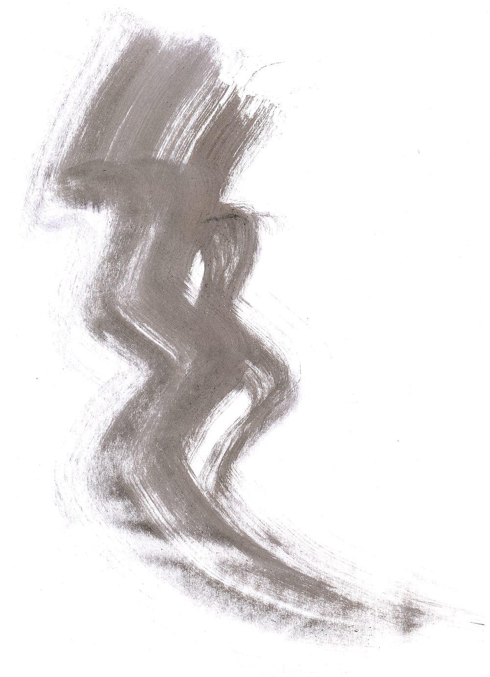
Tip: Ink on paper is the most common starting point, but it's far from the only option. Charcoal, graphite, dry brushstrokes, watercolor splatters, coffee stains, crumpled paper textures: almost anything with interesting texture can become a great brush. You can also use photographs of natural textures like clouds, foliage, or gravel. The key is strong contrast and an interesting silhouette.
Step 2: Convert to Grayscale
Open the scanned image in Photoshop and switch to 8-bit Grayscale mode:
Image → Mode → Grayscale
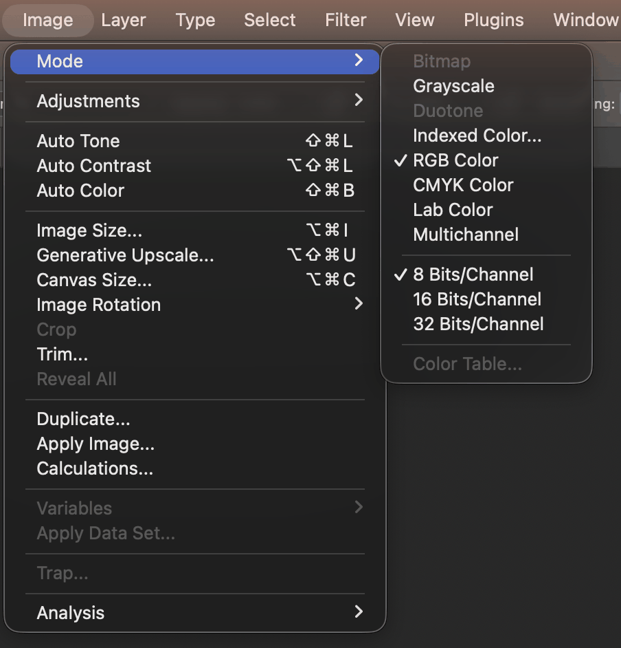
Photoshop asks you to confirm, and the dialog quietly hands you a better option:
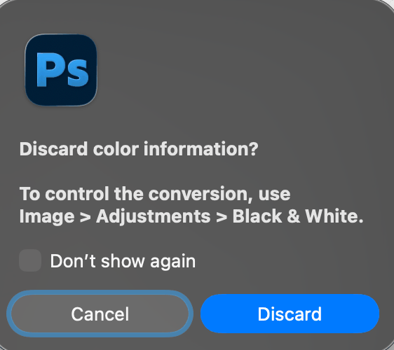
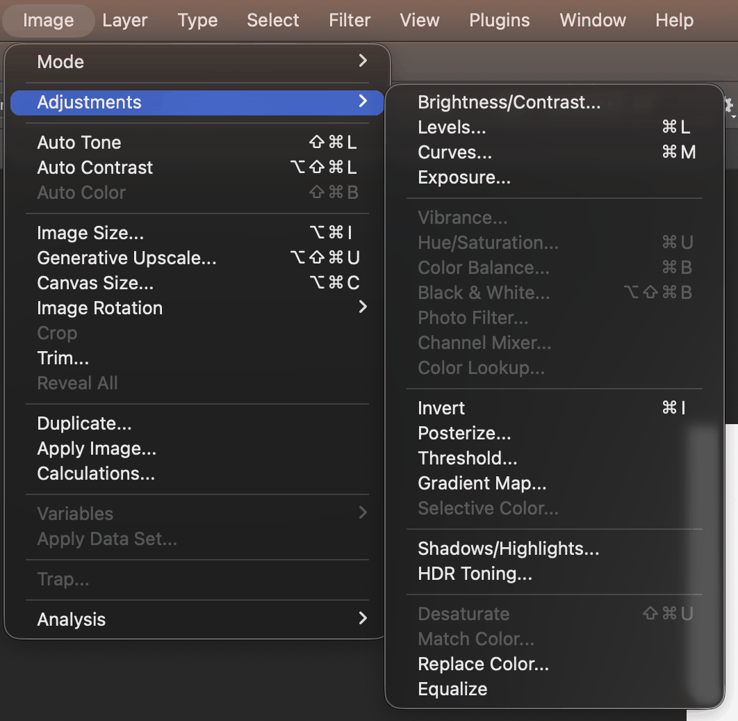
Clicking Discard applies Photoshop's default conversion. If your scan has a color cast (most do), run Image → Adjustments → Black & White first, while the file is still RGB. That gives you a slider per color channel, so you can decide how much the paper's yellow contributes to the gray. Once you switch to Grayscale mode, every color adjustment is greyed out and that choice is gone.
Step 3: Clean Up with Levels or Threshold
Remove scanning noise and sharpen the contrast using one of these adjustments:
- Levels (Image → Adjustments → Levels, or Cmd/Ctrl + L): drag the input sliders to push darks darker and lights lighter. This is the more flexible option and preserves soft edges and subtle gradations.
- Threshold (Image → Adjustments → Threshold): converts the image to pure black and white with no gray in between. Use this when you want a hard-edged, graphic brush.
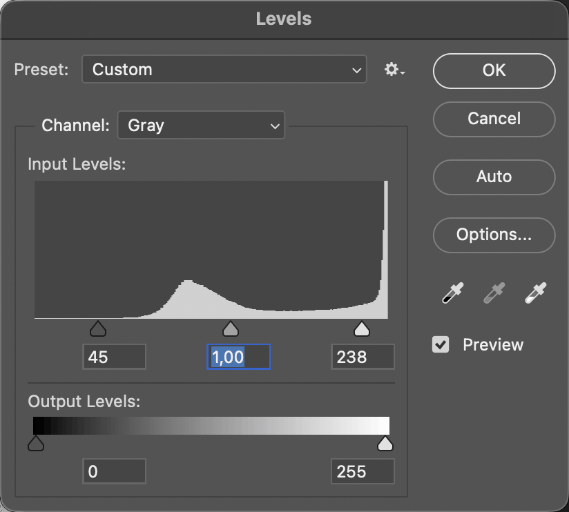
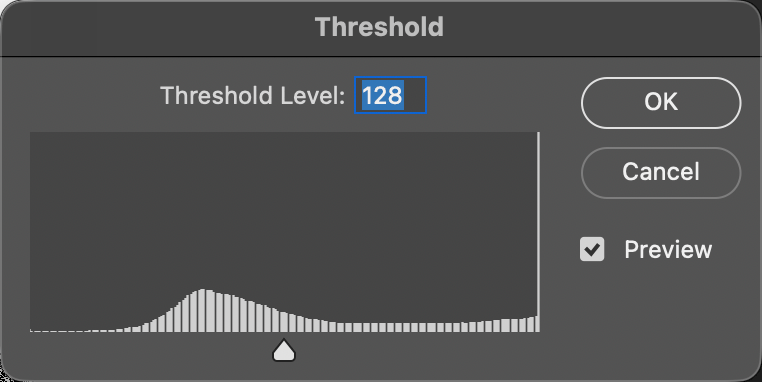
Which one should you choose? Here is the same scan taken both ways:
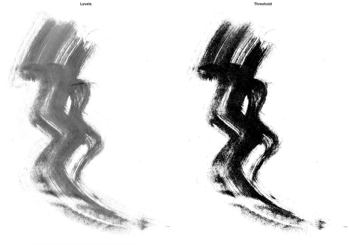
If your source material has delicate textures or soft edges (like watercolor), go with Levels; notice how the dry-brush wisps survive. If you're after a bold, solid silhouette (like a stamp or stencil), Threshold works better, at the cost of every halftone in between.
Step 4: Fix the Background
If the background looks grey or slightly off-white, drag the right Input Levels slider toward the left until the background is pure white. Any area that isn't perfectly white will show up as partially visible in your brush, creating an unwanted halo or bounding box around your stroke.
This is worth measuring rather than eyeballing. Pick the Eyedropper tool, open Window → Info, and hover over the background:
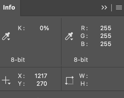
In Grayscale mode the Info panel speaks in ink percentages, not 0–255 levels: K: 0% is pure white, K: 100% is solid black. If you prefer the numbers you see in Levels, click the eyedropper icon on the panel's second readout and switch it to RGB Color. Then a clean background reads 255, 255, 255, as above.
Common mistake: Skipping this step is the number one reason homemade brushes look "dirty." In the scan used here, 7% of the pixels were off-white, at levels 239 to 254 rather than a true 255. That haze is invisible on screen, but it would have veiled every stroke painted with the finished brush.
Step 5: Remove Unwanted Marks
Got stray ink spots or scanning artifacts? Because white is transparent in a brush, painting white over a speck is erasing it, and you can do that without touching the original scan:
- Add a new empty layer above the artwork (Layer → New → Layer…, or Cmd/Ctrl + Shift + N)
- Pick the Brush tool with a soft round tip and set the foreground color to white
- Paint over the stray marks
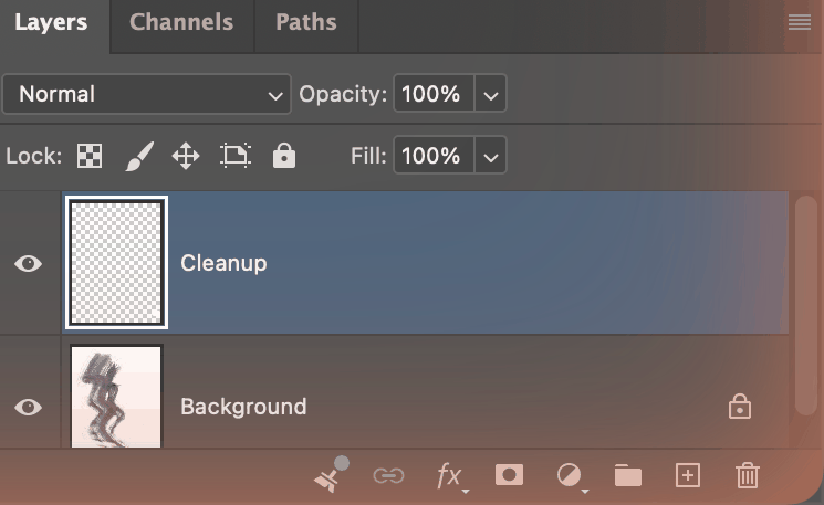
The original layer is never modified, so you can hide, erase, or re-paint the cleanup layer at any time.
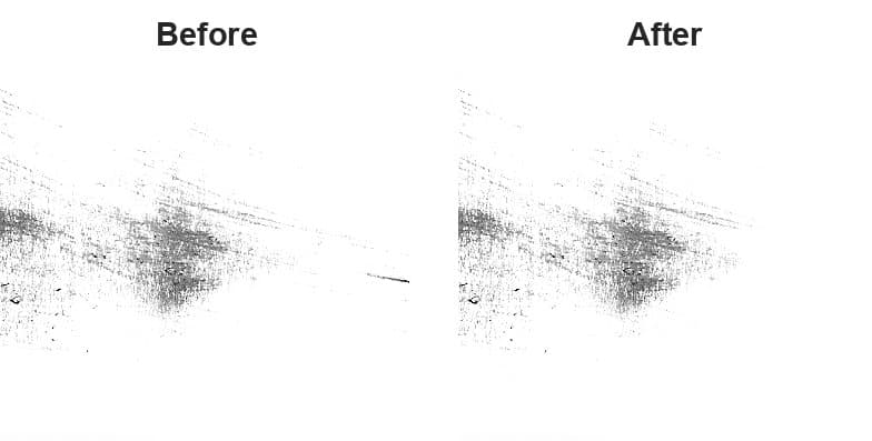
Why not a layer mask? A mask on a duplicated, adjusted layer hides the adjustment and reveals the untouched original underneath: the speck comes back, just lighter. Use masks to control where an adjustment lands; use a white brush on its own layer to remove marks.
Step 6: Fine-Tune the Result
Make any final tweaks to get the stroke looking exactly right. Try these tools:
- Levels (Cmd/Ctrl + L) for overall tonal balance
- Brightness/Contrast for quick and simple adjustments
- Exposure for subtle midtone shifts
- Curves (Cmd/Ctrl + M) for the most precise control over specific tonal ranges
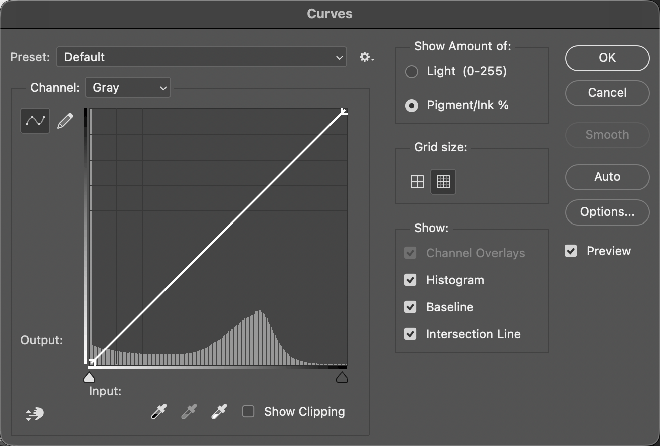
One thing to watch: in Grayscale mode, Curves defaults to Pigment/Ink %, so the curve runs from white at the bottom-left to black at the top-right, the opposite of the 0–255 orientation you may be used to in RGB. Switch Show Amount of to Light (0–255) if you'd rather drag it the familiar way.
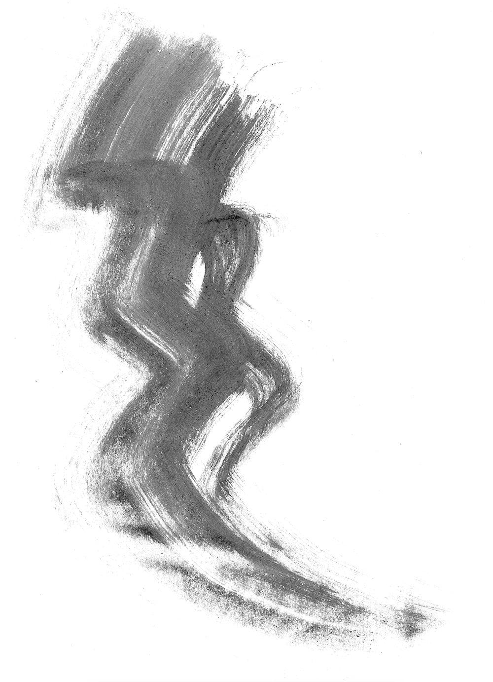
At this point it's worth zooming in to 100% and scrolling around the canvas to make sure everything looks clean. Pay attention to the edges of your artwork: if there's a thin grey border from the scan, crop it away.
Step 7: Define the Brush
Go to Edit → Define Brush Preset, enter a descriptive name, and click OK.
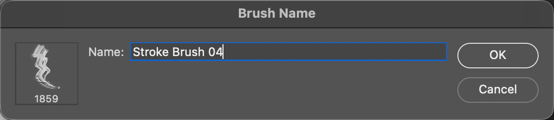
Two things worth knowing about this dialog:
- You don't need to flatten first. Define Brush Preset samples the visible composite, not the active layer. In the run above, the selected layer was the near-empty cleanup layer, and Photoshop still built the brush from the full artwork.
- Photoshop trims pure white for you. The document was 1871 px tall; the resulting brush is 1859 px. Only the non-white bounding box makes it into the preset, which is another reason a truly white background matters.
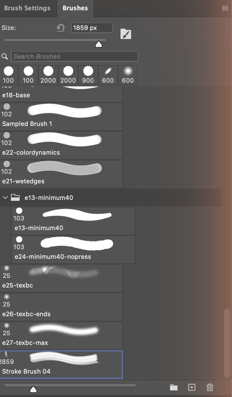
Your new brush immediately appears at the bottom of the Brushes panel, ready to use:
Tweaking Brush Dynamics
Once you've defined a brush, you can dramatically change how it behaves by adjusting Brush Settings (Window → Brush Settings).
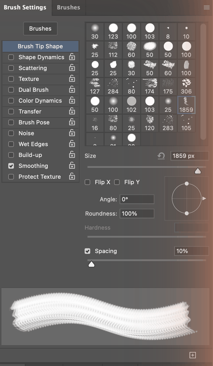
Start with Spacing. A new brush inherits the settings of whichever brush was active when you defined it, not sensible defaults, so a large stamp can arrive at 10% spacing and paint solid mud. Here is the same brush, three times:
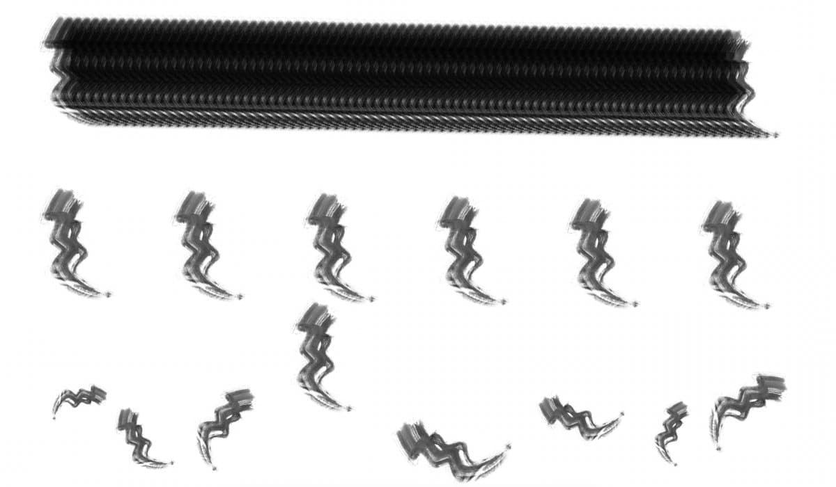
- Spacing is the distance between individual stamps as you drag. At 10% (top) the stamps overlap into an unreadable band; at 150% (middle) each impression of the original stroke is legible.
- Shape Dynamics adds variation to size, angle, and roundness as you paint. The bottom row uses 50% Size Jitter and 25% Angle Jitter. Enable Pen Pressure control if you use a graphics tablet.
- Scattering randomly spreads brush stamps away from the stroke path (120% in the bottom row). Great for foliage, particles, and organic effects.
- Transfer controls opacity and flow jitter, letting you create strokes that naturally fade in and out.
Even a single ink splatter brush can feel completely different depending on these settings, so take the time to play around.
Exporting and Sharing Your Brushes
Want to package your brushes as a shareable .abr file? This is where older tutorials (including the previous version of this one) will send you the wrong way. Edit → Preset Manager no longer handles brushes at all; its Preset Type menu now offers only Contours and Tools.
The current path lives in the Brushes panel:
- Open Window → Brushes
- Select the brushes you want to include (hold Cmd/Ctrl to pick several, or Shift for a range)
- Open the panel menu (the ☰ icon in the top-right corner of the panel)
- Choose Export Selected Brushes…
- Pick a location and name your .abr file
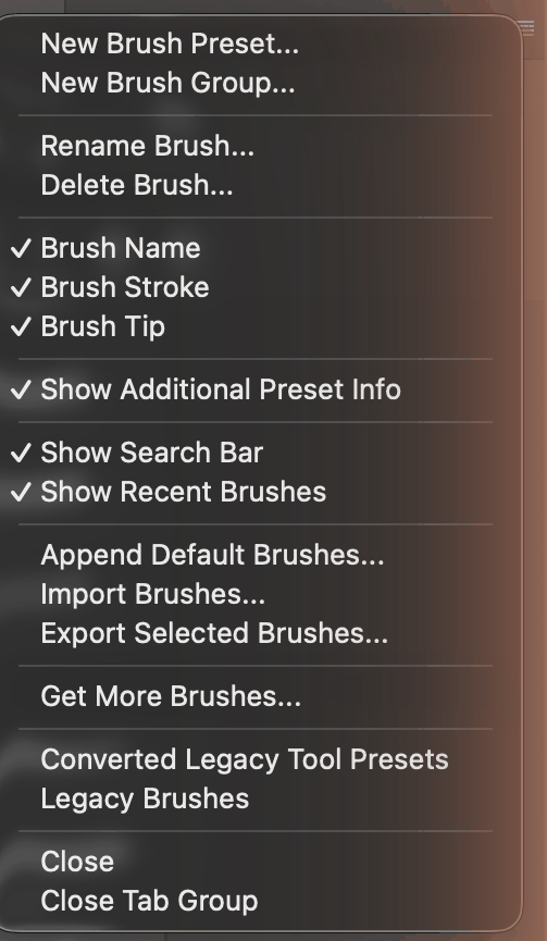
The same menu holds Import Brushes…, which is how anyone you share the file with will load it.
Tip for organizing large packs: Give each brush a clear, descriptive name before exporting (e.g. "Ink Splatter Large 01", "Dry Brush Thin 03"). It makes the pack much more user-friendly for anyone who downloads it, including future you. Use New Brush Group… in the same menu to keep a large set tidy.
Common Mistakes to Avoid
- Working too small. If you define a brush at 500 px, it will blur when used at 5000 px. Always start large.
- Leaving a non-white background. Even barely-visible grey causes a "dirty box" effect around the brush.
- Converting to Grayscale before correcting the color cast. Once you're in Grayscale mode, Black & White, Hue/Saturation, and Channel Mixer are all unavailable.
- Ignoring the edges. Scan artifacts often lurk at the very edges of the canvas. Crop generously.
- Not checking Spacing. A brand-new brush inherits the previous brush's dynamics, and the wrong spacing makes good artwork look terrible.
- Not testing the brush. Before exporting, paint a few test strokes on a new canvas at various sizes and opacities to catch any issues early.
Frequently Asked Questions
How do Photoshop brushes work?
Photoshop brushes work by reading grayscale values in your source image. White areas become fully transparent, black areas fully opaque, and gray tones create varying translucency. Always work at the maximum practical size: scaling down is fine, but enlarging beyond the original dimensions introduces blur.
What is the maximum size for a Photoshop brush?
The maximum brush size in Photoshop 2026 is 5000 x 5000 pixels. Define Brush Preset stays available on a 5000 pixel document and is greyed out at 5001. The 2500 x 2500 limit quoted in older tutorials dates back to Photoshop 7 and no longer applies.
How do I export my brushes as an .abr file?
Open Window > Brushes, select the brushes you want to include, open the panel menu in the top-right corner, and choose Export Selected Brushes. Then pick a location and name your .abr file. Edit > Preset Manager no longer lists brushes; in Photoshop 2026 it only handles Contours and Tools.
Do I need to flatten my image before defining a brush?
No. Edit > Define Brush Preset samples the visible composite rather than the active layer, so a multi-layer document works fine. Photoshop also trims pure white automatically, so the brush is only as large as its non-white bounding box.
What brush settings should I adjust after creating a brush?
Start with Spacing, because a new brush inherits the previously active brush's settings rather than defaults: a large tip at 10% spacing paints a solid band. Then explore Shape Dynamics (variation in size, angle, roundness), Scattering (random spread of stamps), and Transfer (opacity and flow jitter). Access them via Window > Brush Settings.