10 Creative Ways to Use Photoshop Brushes Beyond Painting
When most people hear "Photoshop brushes," they picture someone painting digitally: stroking across a canvas, building up color. And sure, that's what brushes were made for. But after years of running a site dedicated to Photoshop brushes, I've learned that painting is honestly just the beginning.
The best designers I know treat brushes more like stamps, textures, and secret weapons than traditional painting tools. Once you start seeing them that way, you'll find uses everywhere.
Here are ten of my favorites. Every example and every panel screenshot below comes from a real run through the technique in Photoshop 2026, using free brush sets from this site.
1. Textured Typography
This one changed the game for me. Instead of hunting for a perfect textured font, you can take any clean typeface and give it a unique look in seconds.
The idea is simple: type your text, then use a grungy or textured brush directly on the layer mask. Black hides, white reveals, so every brush stroke chips away at the letters, giving them a weathered, hand-made feel.
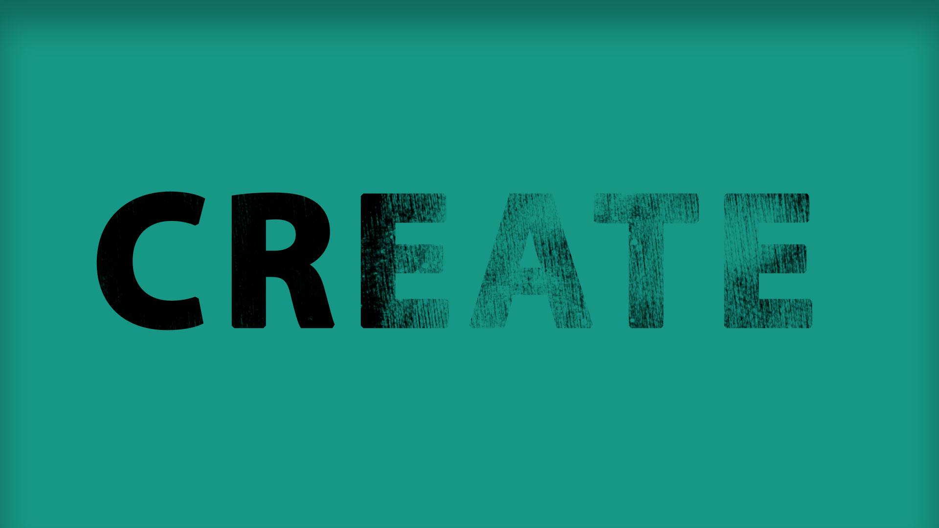
I use this all the time for poster designs and social media headers. It takes literally 30 seconds and the result looks like you spent an hour in Illustrator.
Try it with: Wet Grunge Brushes Set or Ultimate Grunge.
2. Instant Custom Backgrounds
Here's a trick that saves me whenever I need a background fast and stock photos won't cut it.
Pick two or three decorative brushes: florals, abstract shapes, whatever fits the mood. Set the opacity to around 10–20%, pick a color slightly different from your background, and stamp away. Layer a few on top of each other, vary the size and rotation, and suddenly you've got an elegant, unique background that took 60 seconds.
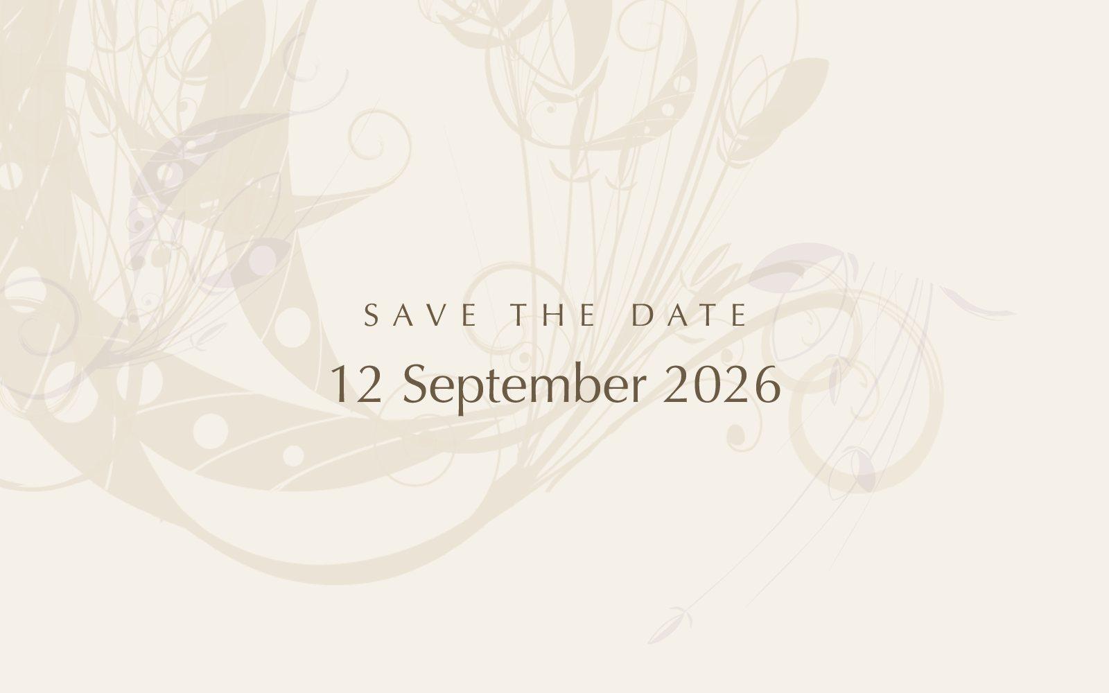
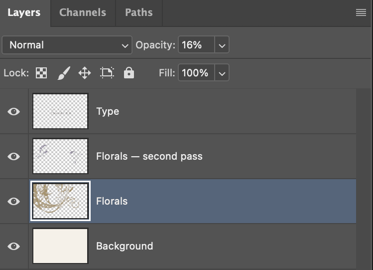
The opacity is doing all the work here. Stamp at full strength and the florals fight your text; drop the layer to 16% and they turn into paper texture.
It's especially great for invitation designs, presentation slides, or anywhere you need something that feels custom but don't have time to illustrate from scratch.
3. Light Effects and Bokeh
This is probably the most popular "secret" use of brushes among photographers and retouchers. You can fake surprisingly convincing bokeh, light leaks, and sparkle effects with scatter brushes.
Set a round brush with size jitter, scattering, and transfer dynamics cranked up. Pick a warm highlight color. Stamp it on a new layer, set the blend mode to Screen or Soft Light, and you've got dreamy light circles floating across your image.
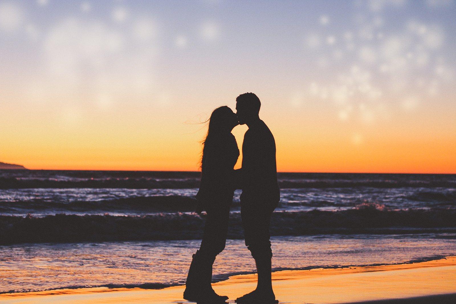
Scatter with Both Axes turned on is what stops the dots from lining up like beads on a string. Count 3 lays down three at a time, so a single short stroke gives you a whole cluster.

Restraint matters more than the settings do. My first pass covered the whole frame and buried the photo. The version above is two short strokes at 55% layer opacity.
4. Organic Photo Borders
Rectangular edges are boring. There, I said it.
One of the simplest ways to make a photo feel more artistic is to mask the edges with a textured brush. Use a large splatter, watercolor, or ink brush on the layer mask around the edges of your photo. The result is an organic, hand-crafted border that feels way more interesting than a sharp rectangle.
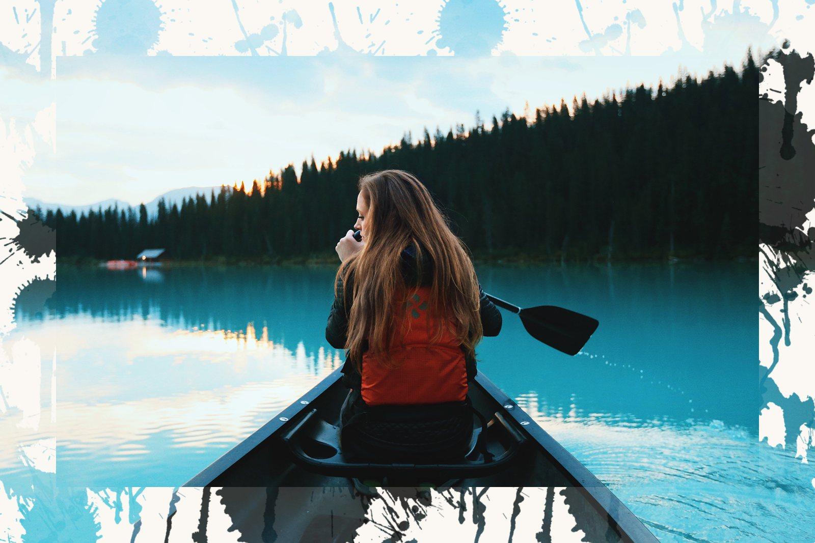
The trick is to start from a clean rectangle and let the brush push outward from it, rather than attacking the photo from all sides. Look at the mask thumbnail: a white block with splatters growing off its edges.
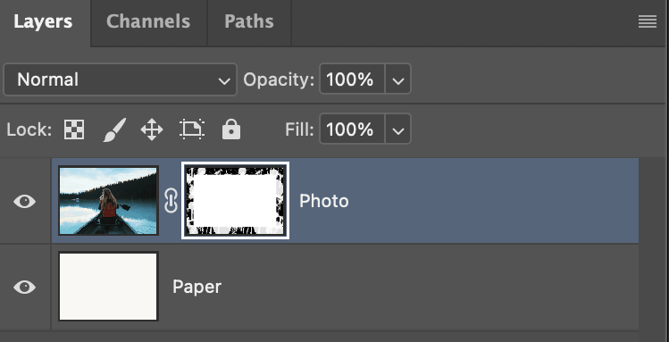
This works beautifully for portfolio presentations, photo albums, and Instagram posts where you want that editorial, gallery-wall vibe.
5. Distressing Flat Design Elements
Flat design is clean and modern, but sometimes it's too clean. A little bit of texture goes a long way.
Take any shape, icon, or vector element and add a layer mask. Then stamp a grunge or noise brush on the mask. Instantly, your perfectly smooth gradient button or icon gets that lived-in, screen-printed quality that's so popular in indie branding and vintage-style designs.
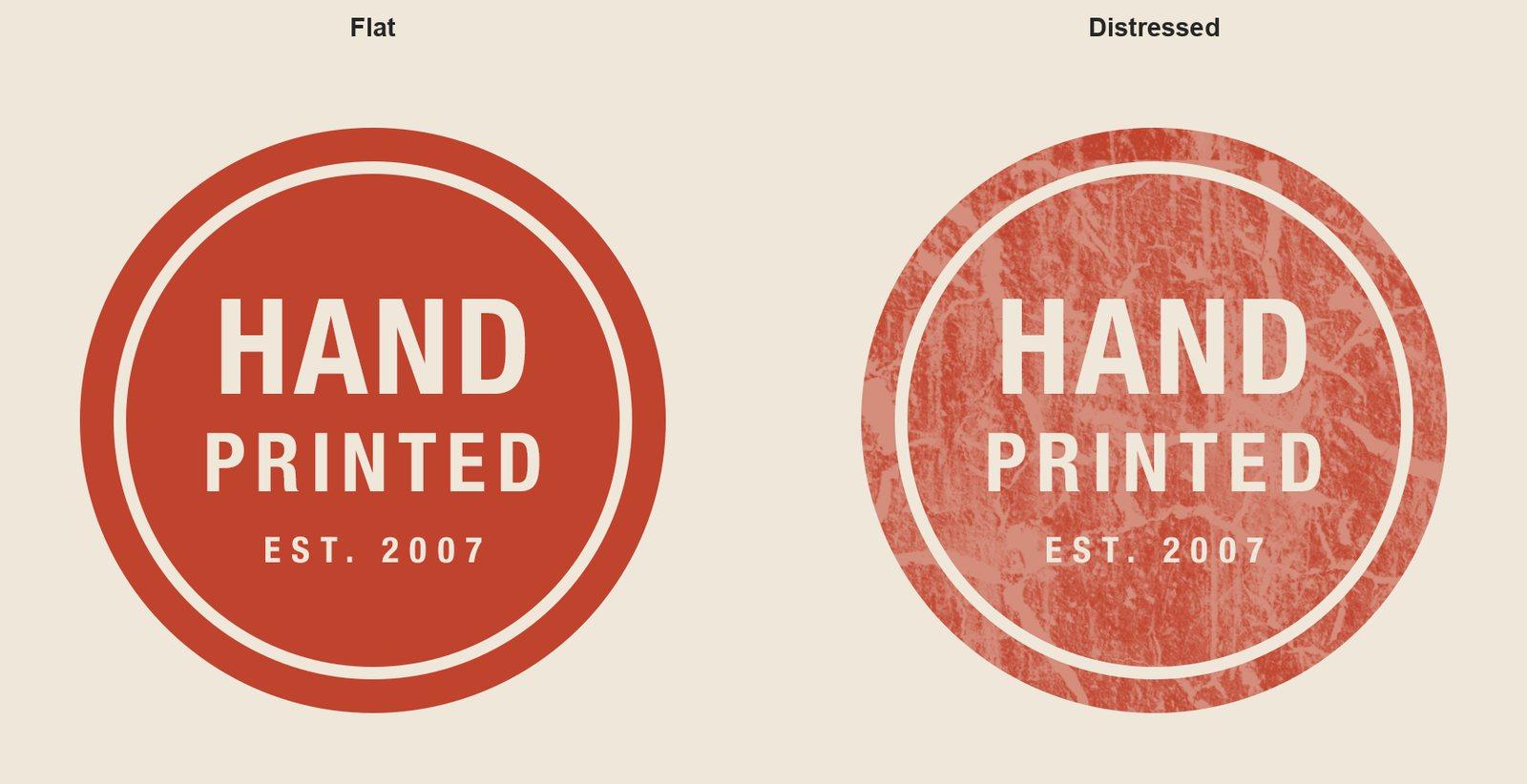
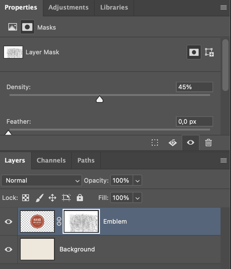
The key is subtlety. You don't want to destroy the design, just give it a little bit of character. My first attempt chewed the emblem to the point where the type stopped reading. The fix wasn't repainting the mask, it was the Density slider in the Properties panel: same brushwork, dialed back to 45%.
Think of it like the difference between a brand new pair of jeans and ones that have been worn in a little.
6. Fog, Smoke, and Atmosphere
This one is essential for anyone doing photo compositing or manipulation. Need to blend a foreground subject into a new background? Drop some fog between the layers.
Cloud and smoke brushes on a layer set to Normal or Screen, with reduced opacity, can create incredibly convincing atmospheric depth. I've used this trick hundreds of times and it never stops being useful.
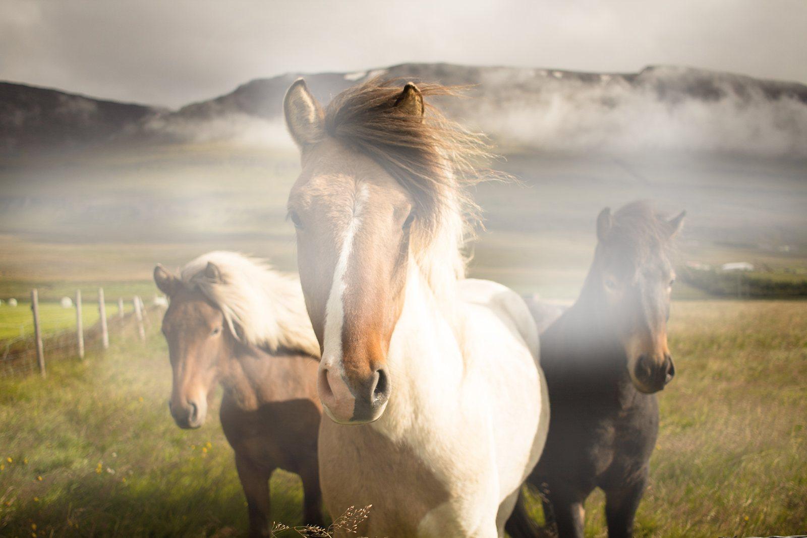
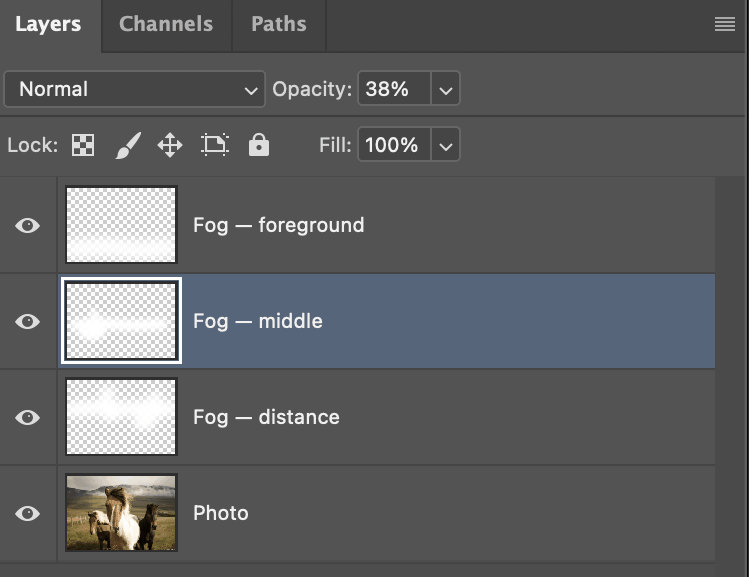
The trick that most people miss: don't just use one big cloud stamp. Real fog isn't uniform, so build it up in separate passes: one hugging the horizon at high opacity, one threading through the middle, one thin veil in front. Give each pass its own layer and its own opacity, and blur each one so the brush texture reads as air rather than as ink.
7. Custom Watermarks
If you're a photographer or artist publishing work online, you need a watermark. And turning your signature or logo into a Photoshop brush is the fastest way to apply one consistently.
Write your name or draw your logo in black on a white background, then run Edit → Define Brush Preset. Photoshop reads the luminance: black becomes opaque, white drops out entirely, so you get a clean stamp with no background to erase later.
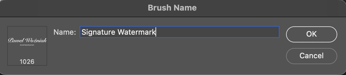
Now you've got a one-click watermark you can stamp on any image. Set the layer opacity to somewhere around 20–30%, and it's visible enough to protect your work without distracting from it.
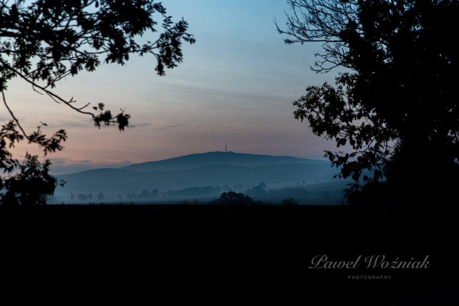
I know it sounds obvious, but I'm constantly surprised how many people manually place their logo as a separate layer every single time. The brush approach is faster and more consistent.
Related: Check our tutorial on how to create Photoshop brushes if you've never defined a custom brush before.
8. Hair and Detail Retouching
Portrait retouchers have known this for years: specialized hair brushes are a lifesaver. Flyaway hairs, thin strands that need filling in, eyelashes that need a boost. The right brush with the right settings can handle all of it.
You paint in individual strands on a new layer, color-picking from the surrounding hair. What separates a convincing result from an obvious one is entirely in the Shape Dynamics: Angle Jitter set to Direction makes the strands follow the curve of your stroke instead of all pointing the same way, and Size Jitter on pen pressure keeps them from looking machine-stamped.
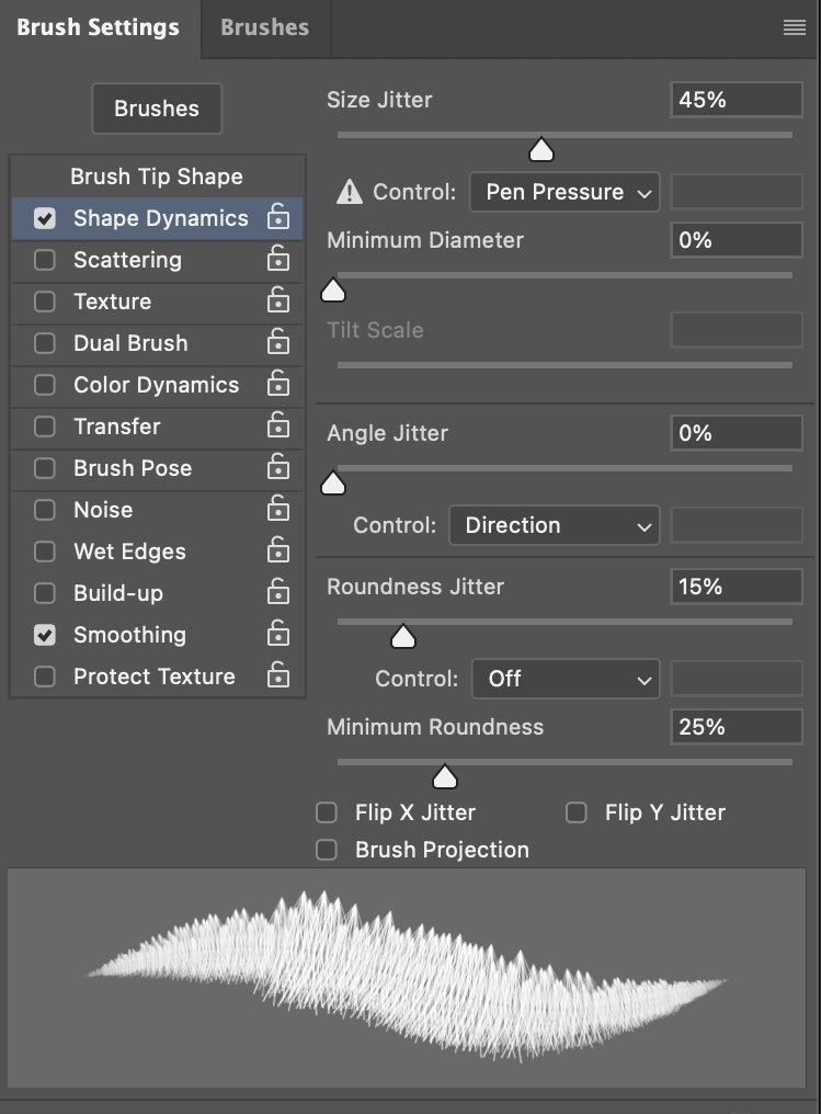
I'll be honest with you: this is the one technique on this list where the brush does not do the work for you. Without those dynamics (and without a tablet), stamped strands read as spikes, not hair. With them, and with a light hand, five minutes of brushwork can replace thirty minutes of clone-stamping.
9. Building Seamless Patterns
Here's something I don't see enough people doing: using brushes as building blocks for patterns.
Stamp a decorative brush on a square canvas, arrange a few stamps in a pleasing composition, then use Edit → Define Pattern.
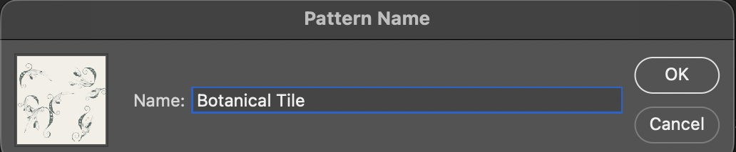
One step makes the difference between a pattern and a grid of obvious squares: halfway through, run Filter → Other → Offset at half your tile size with Wrap Around on. That drags the tile edges into the middle, so the stamps you add next land across the seam and the repeat has nothing to give it away.
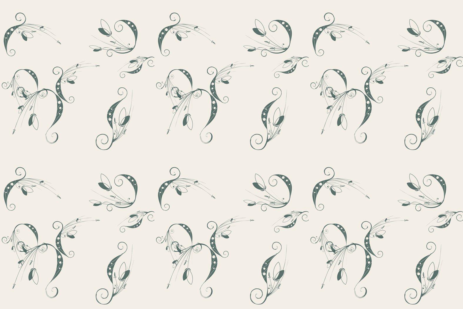
Our patterns section has hundreds of ready-made patterns, but when a client needs something unique, this is my go-to method. Ten minutes and you've got something completely custom.
10. Social Media Decorative Accents
Last but definitely not least: brushes are perfect for adding quick decorative touches to social media graphics.
A scatter of stars around a product photo. A floral corner accent on a quote card. Paint splashes behind a headline. These little details are what separate "I made this in Canva" from "a designer made this." And with the right brushes loaded, you can add them in seconds.
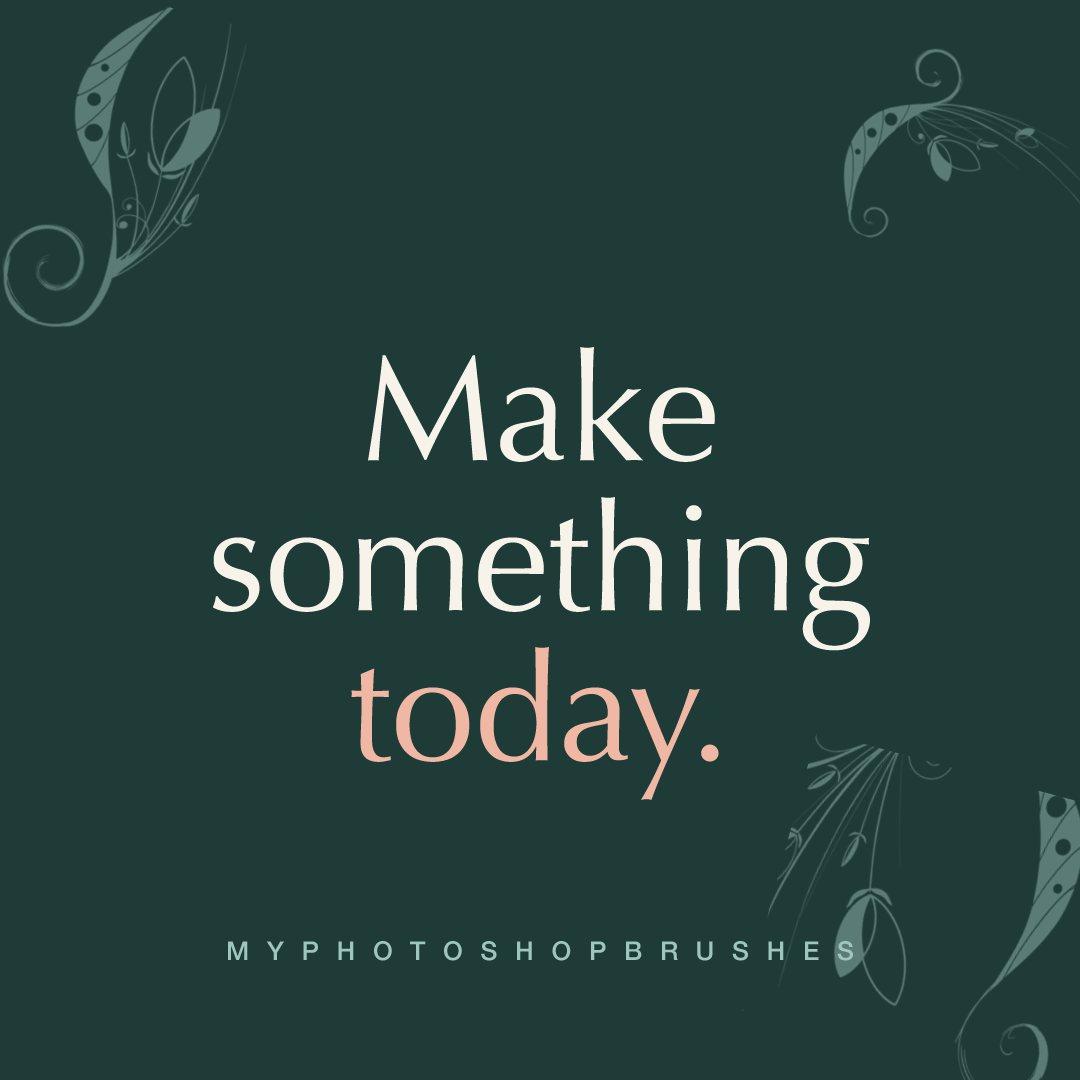
I keep a few favorite brush sets loaded specifically for this: some star scatters, some floral accents, a couple of abstract shapes. They've become part of my toolkit and I reach for them almost daily.
Wrapping Up
Look back at the panel screenshots in this article and you'll notice how little of the work happens in the brush picker. It's an opacity slider, a mask thumbnail, a Density field, a Scatter value. The brush supplies the shape; everything that makes the shape useful is one setting away from it.
That's the real shift: from "tool for painting" to "tool for anything." Once it clicks, you'll find new uses constantly.
If you're building your brush collection, browse our full library of free Photoshop brushes. We've been curating it since 2007 and there are hundreds of sets to explore.
Got a creative brush trick I didn't cover? I'd love to hear about it.