Ink Design Assets
27 free resources: 23 brushes, 1 free psd, 1 images, 1 procreate brushes, 1 textures
Browse Ink resources
Ink brushes carry something vector work rarely fakes: the accident of a loaded brush meeting paper, and the mess it leaves behind.
That accident is the reason designers keep a set within reach. A poster that needs weight in one corner, a band logo that has to look pulled rather than placed, a comic panel where the line still has to breathe. All of it comes down to how the stroke ends. Making those endings by hand means owning the right nibs, the right paper, a scanner, and an afternoon you probably do not have. The twenty-five files collected here cover the part that takes longest: the strokes, the splatters, the bleed at the edge of a wash, and the paper grain sitting underneath. Between them they have been downloaded a little over 1.4 million times, which is a reasonable proxy for the ones that actually survive contact with a deadline.
Most popular
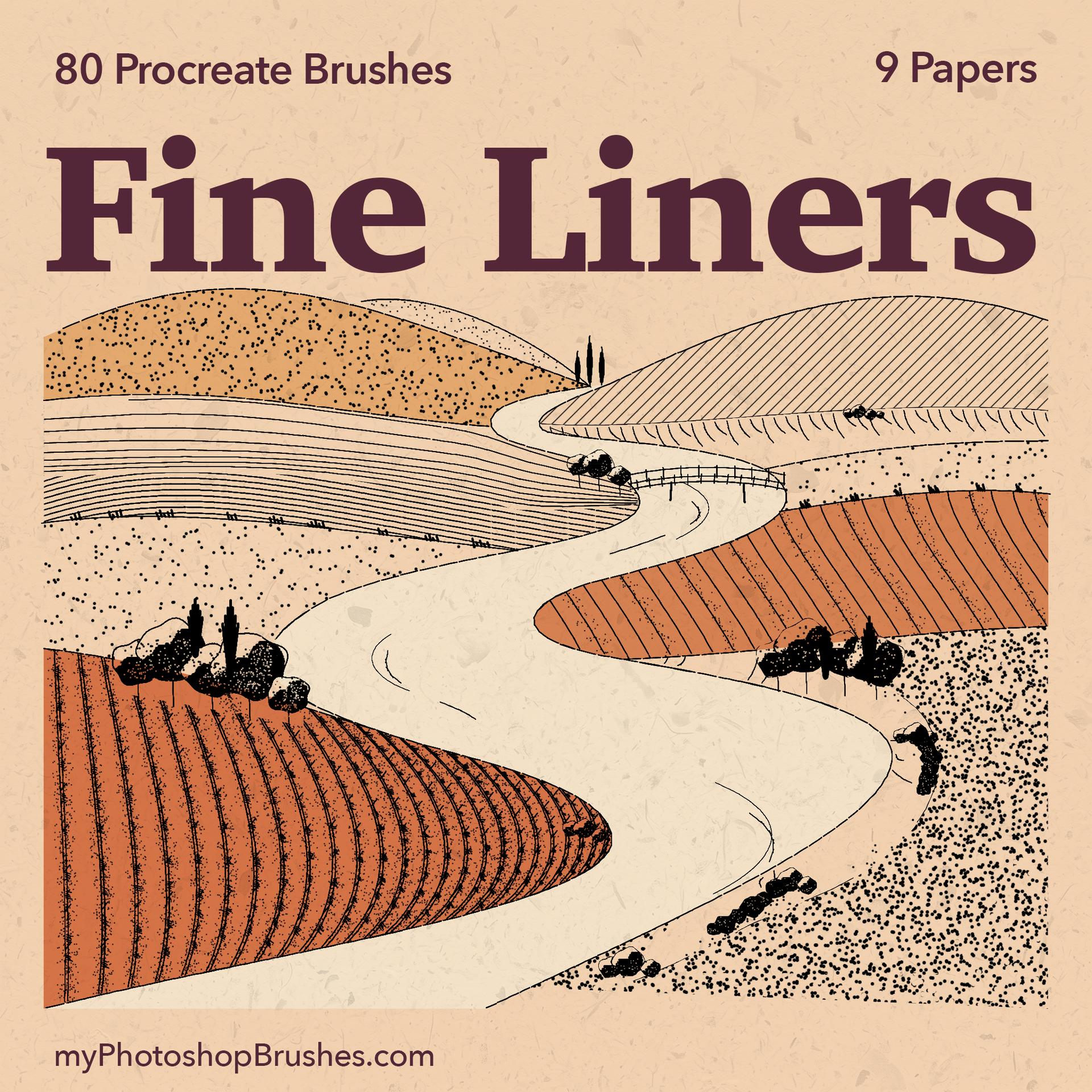
80 Free Fine Liner Procreate Brushes
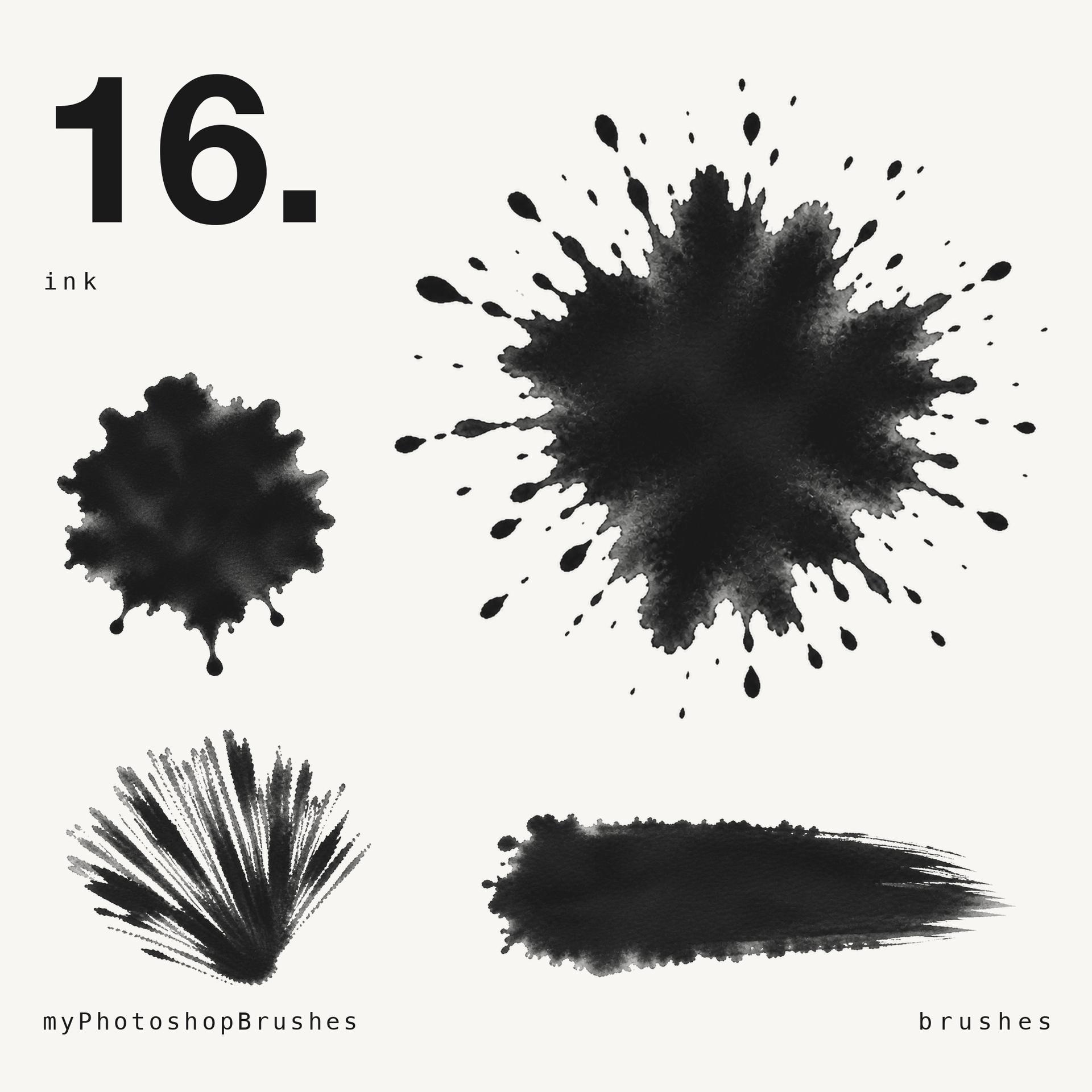
16 Free Ink Brushes
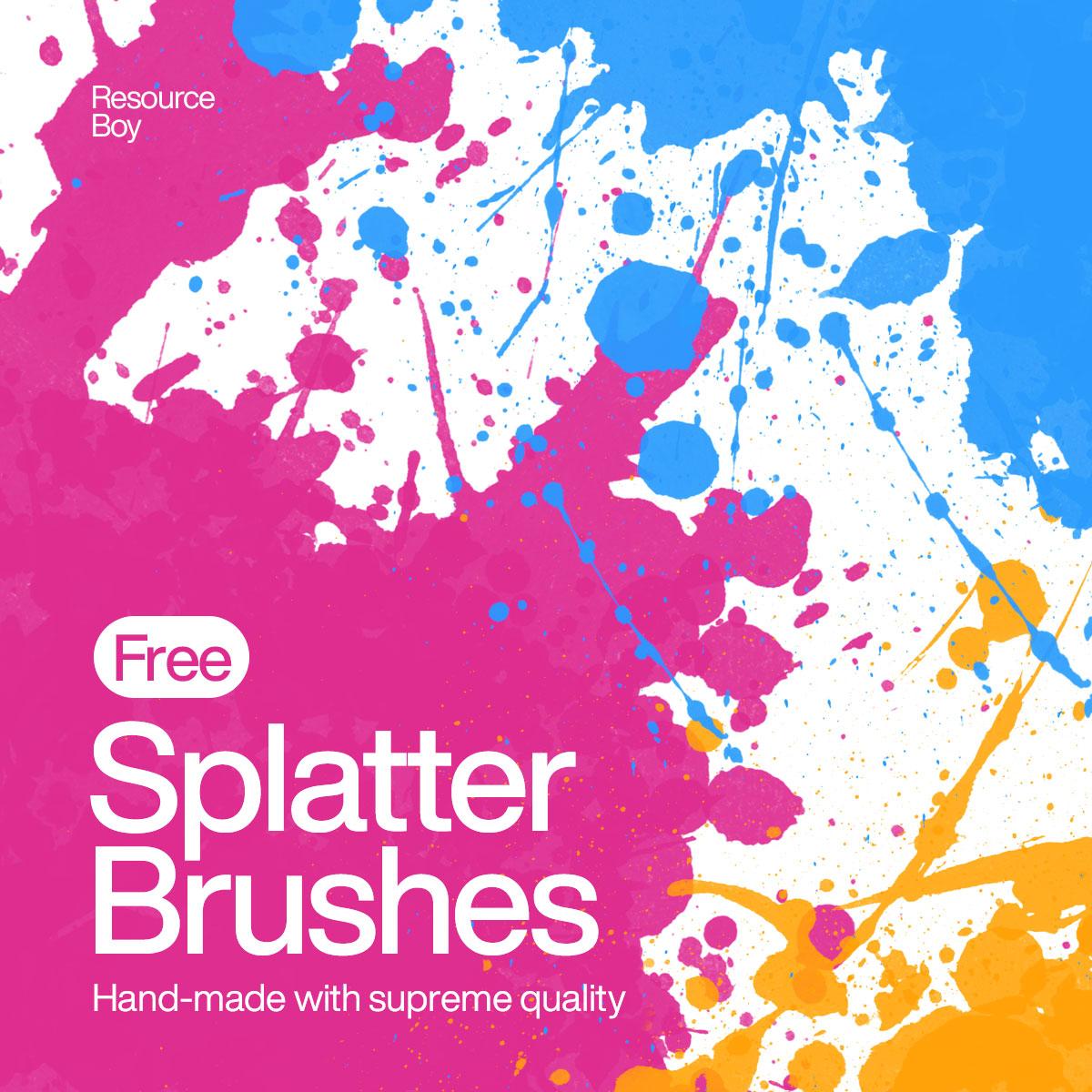
Splatter Photoshop Brushes
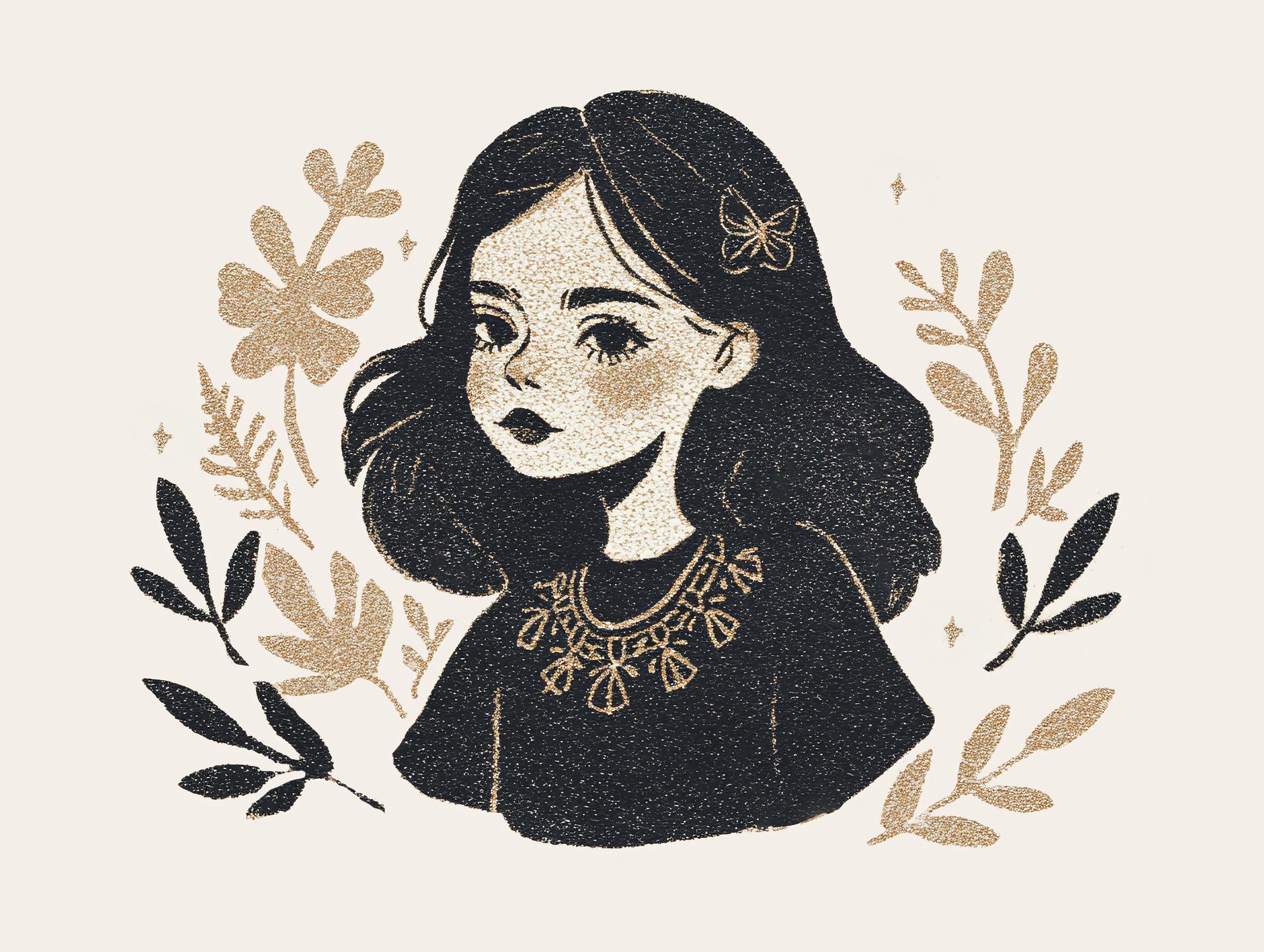
Gold and Ink Girl Portrait
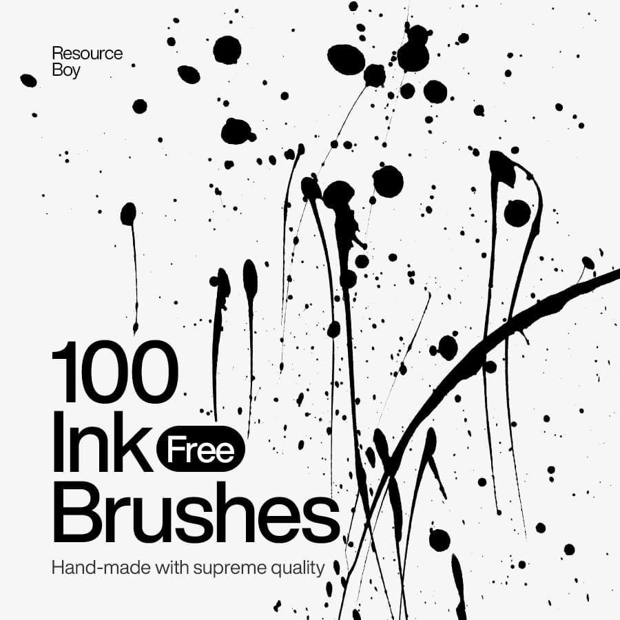
100 Ink Photoshop Brushes
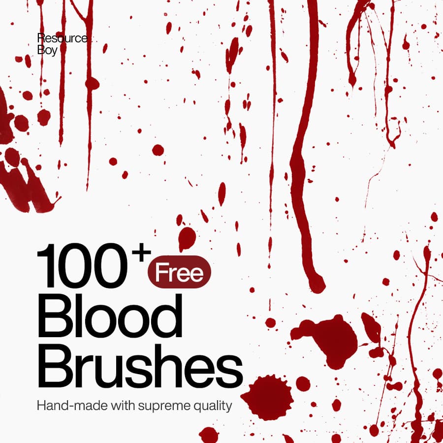
100+ Blood Photoshop Brushes
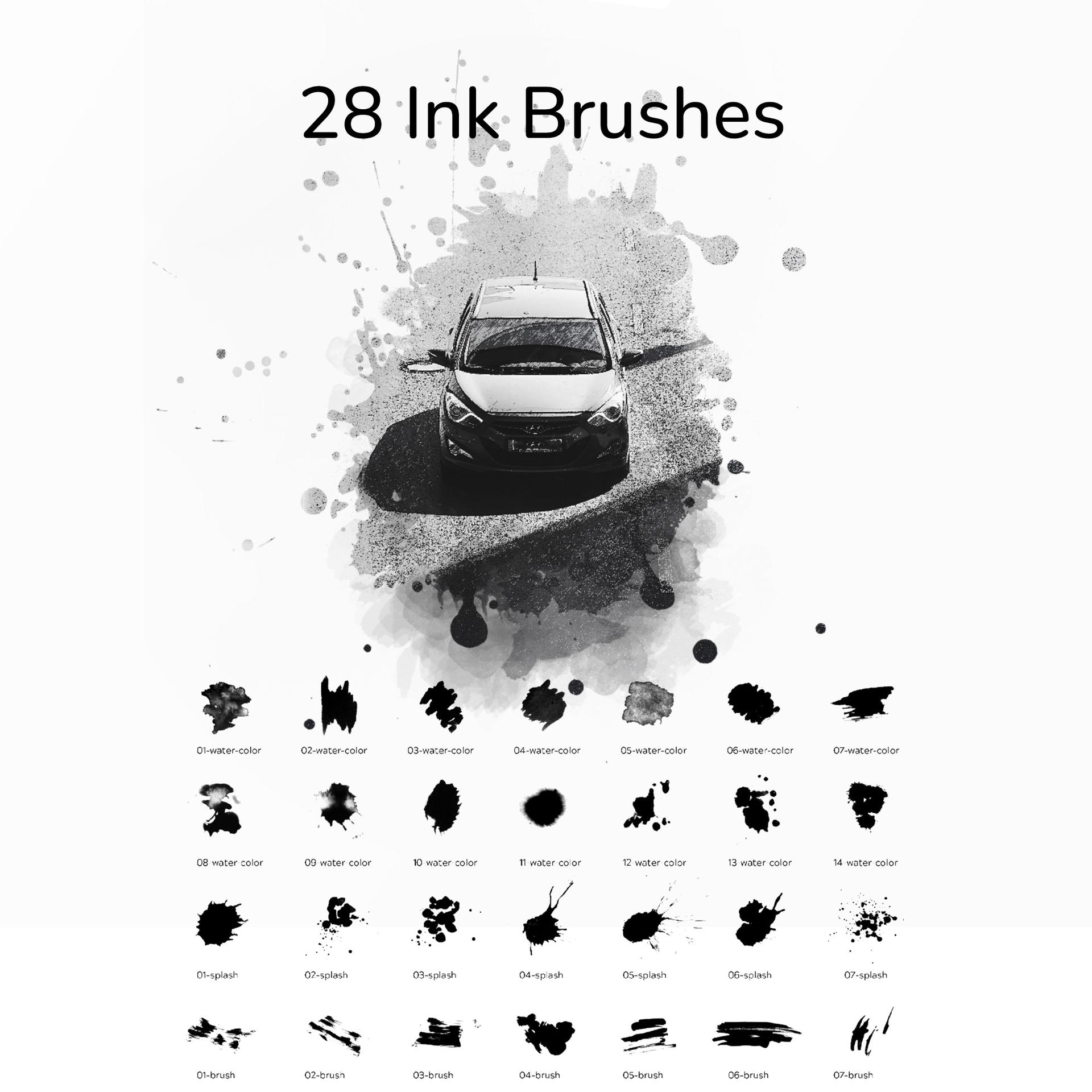
28 Ink Brushes
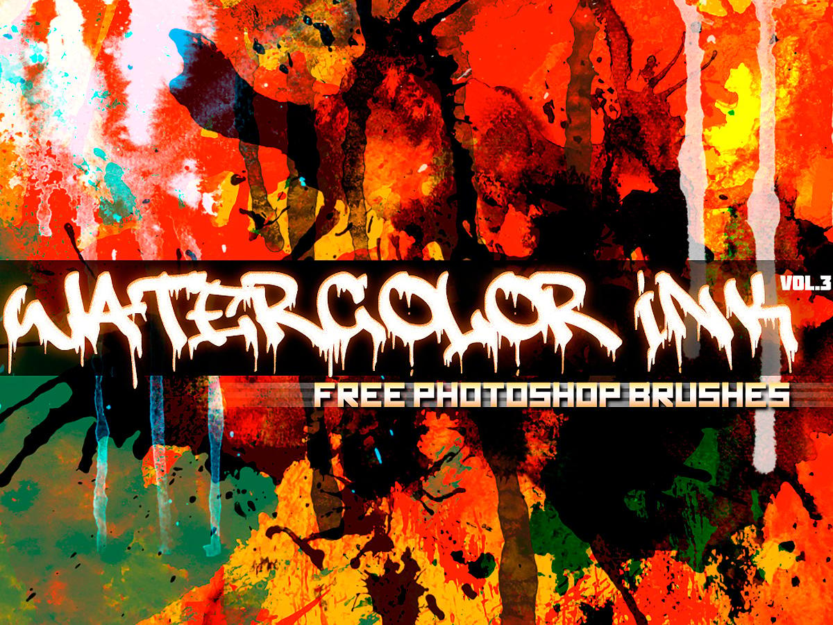
Watercolor & Ink brushes - Vol.3
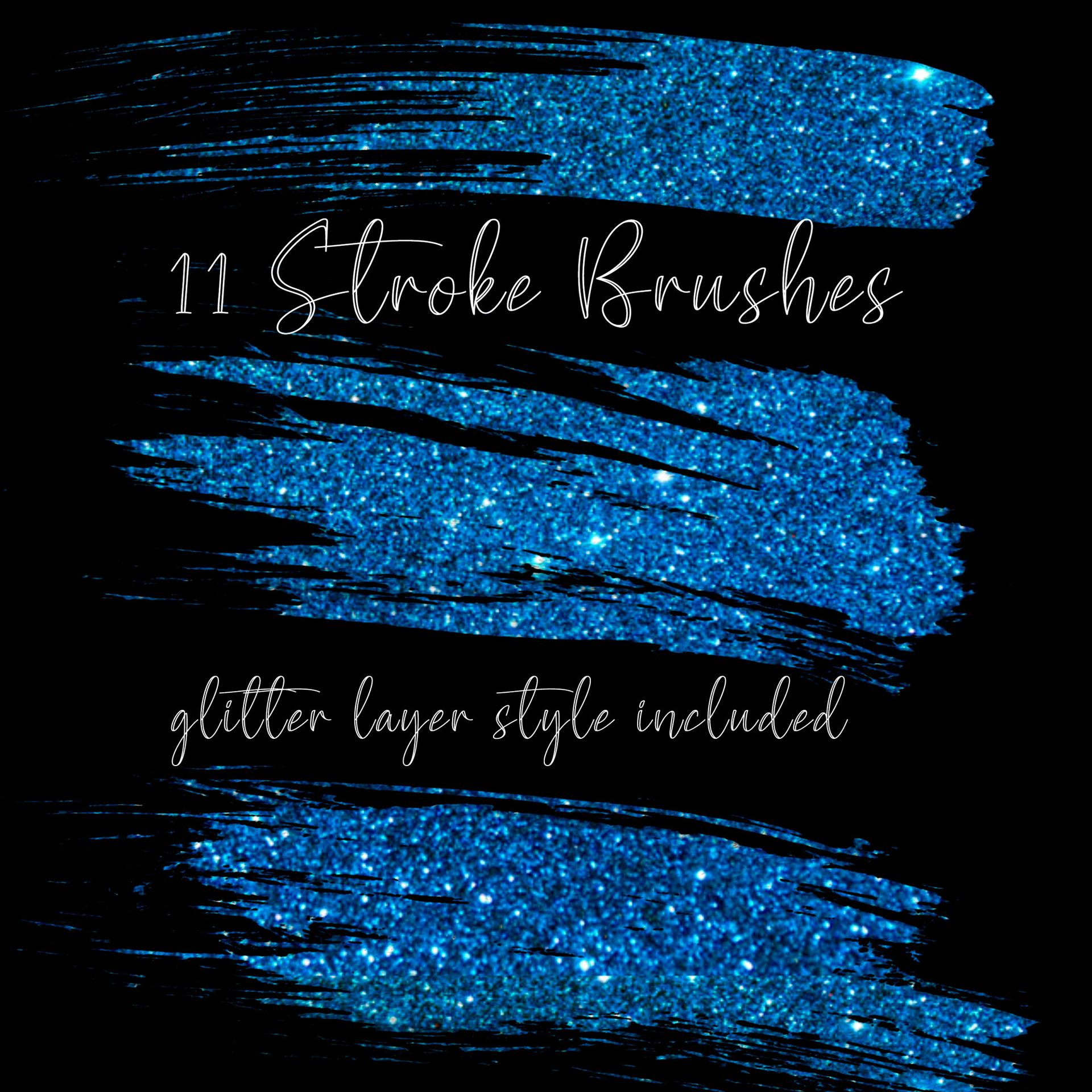
11 Stroke Brushes
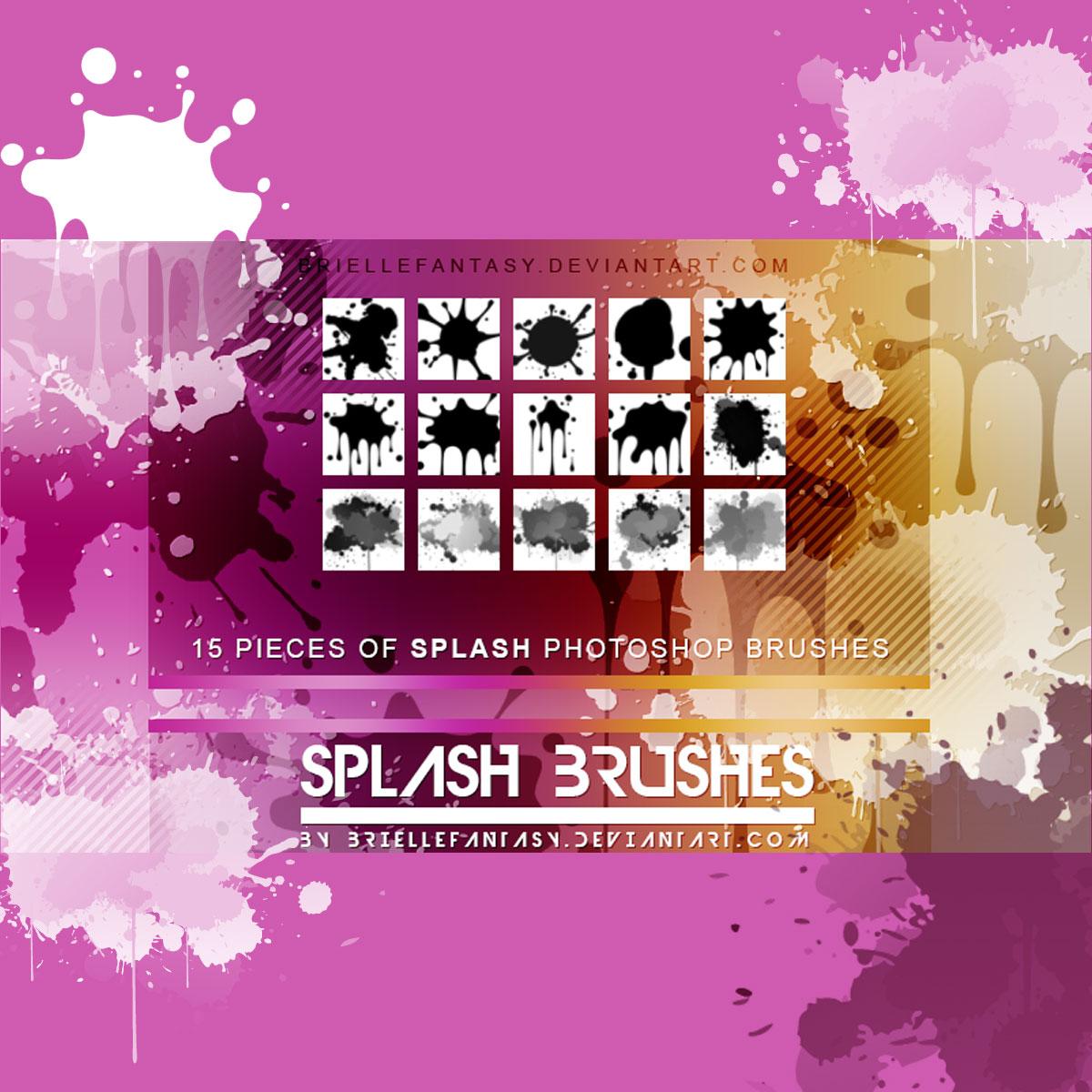
15 Splash Brushes
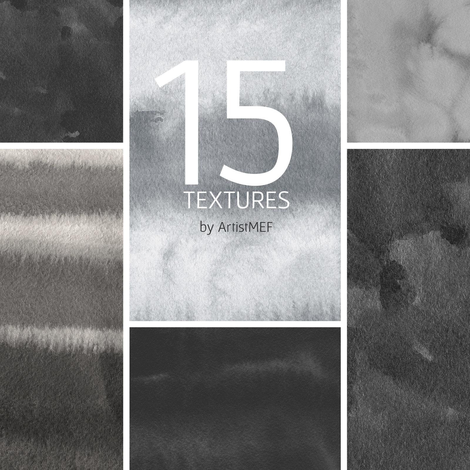
15 Free Ink and Paper Textures
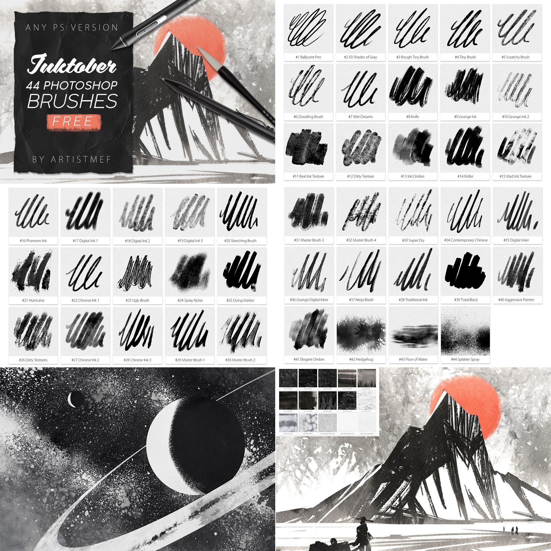
44 Ink Photoshop Brushes
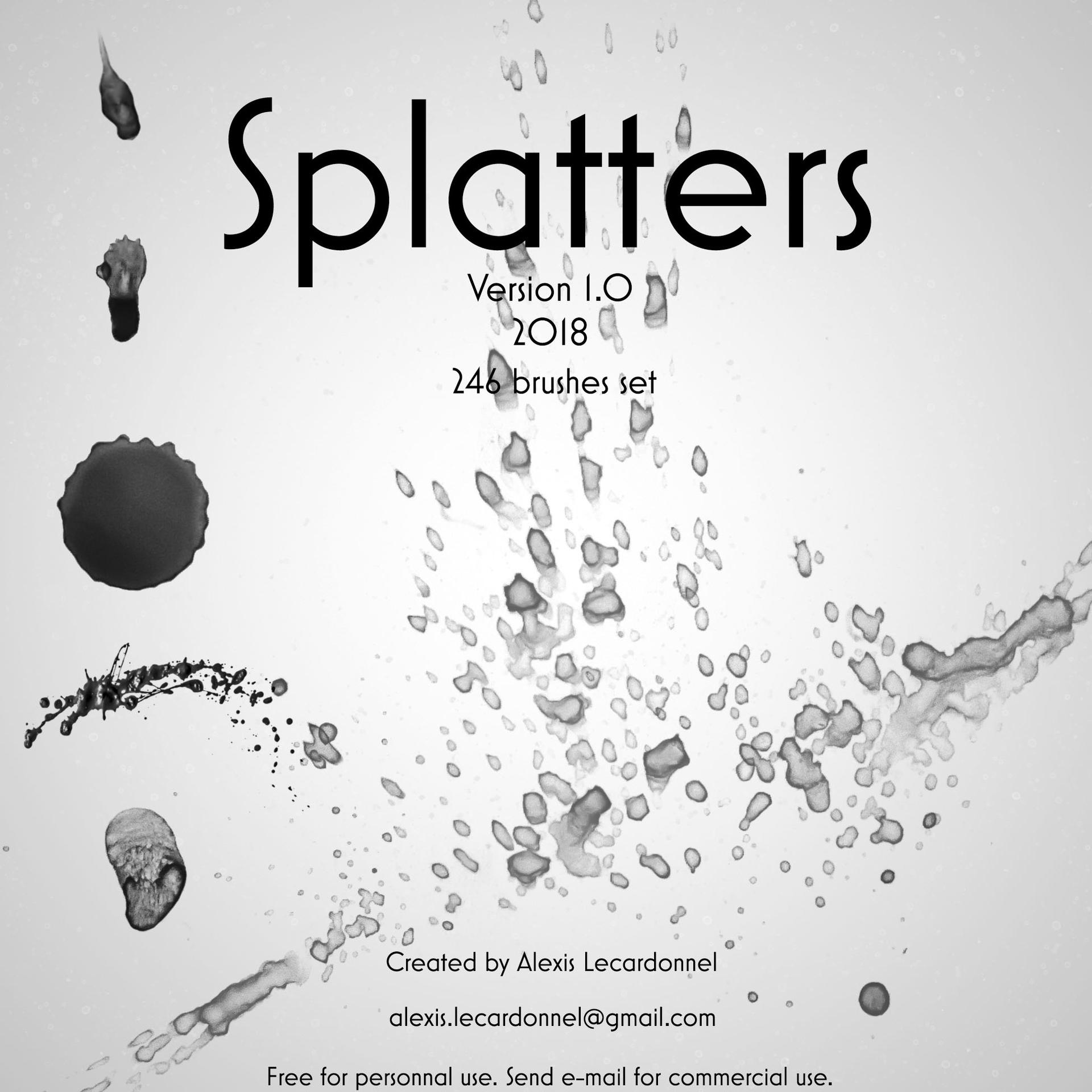
Splatters v1.0 by Alexis Lecardonnel
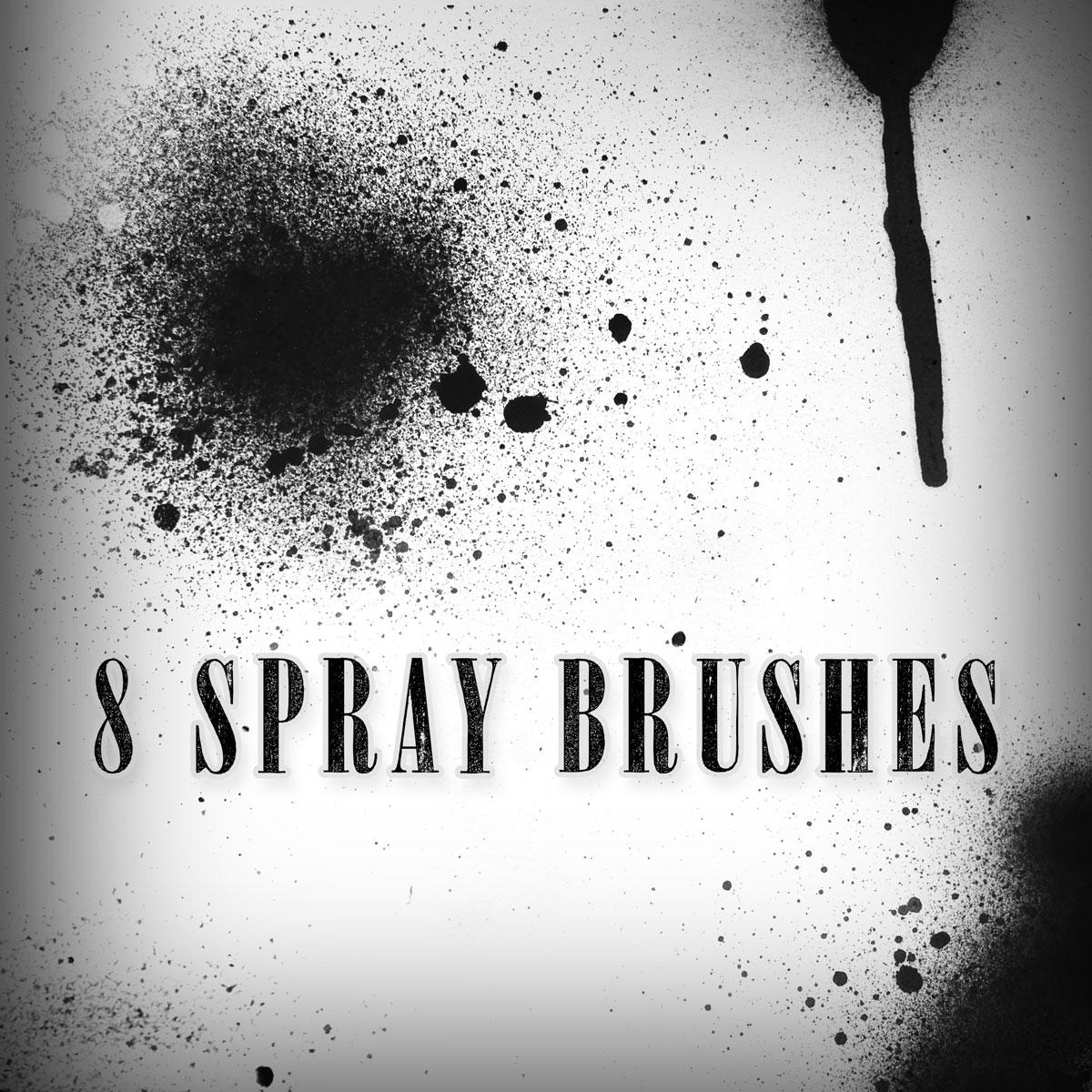
8 Spray Brushes
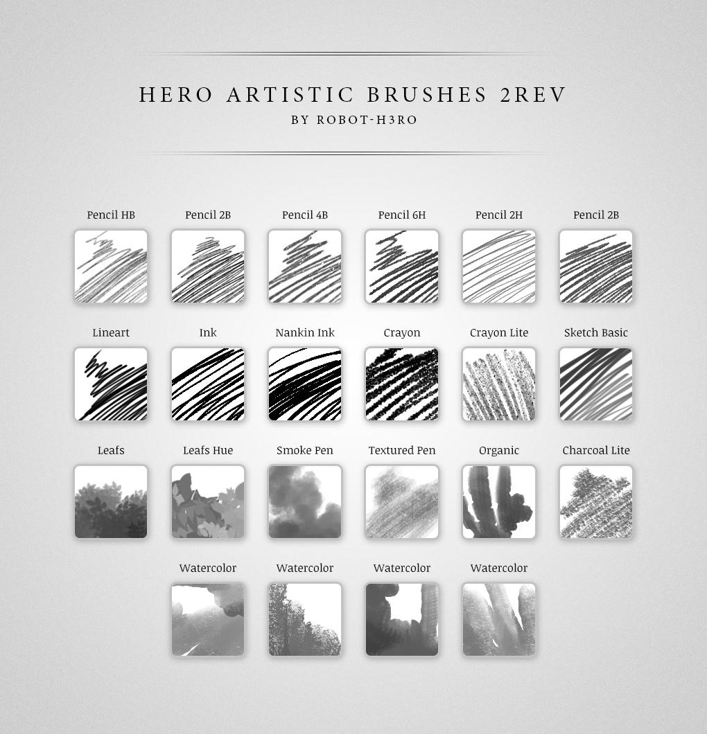
Draw and Paint Brushes Pack
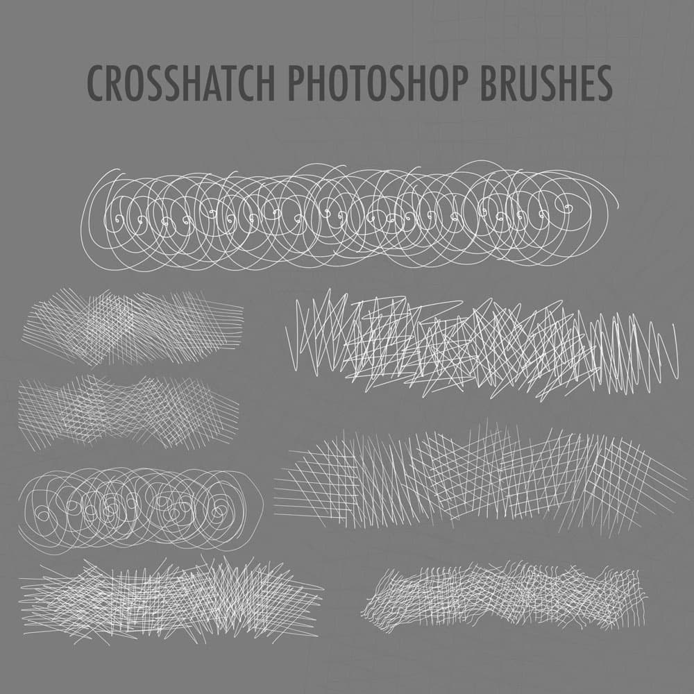
Crosshatch Photoshop Brushes
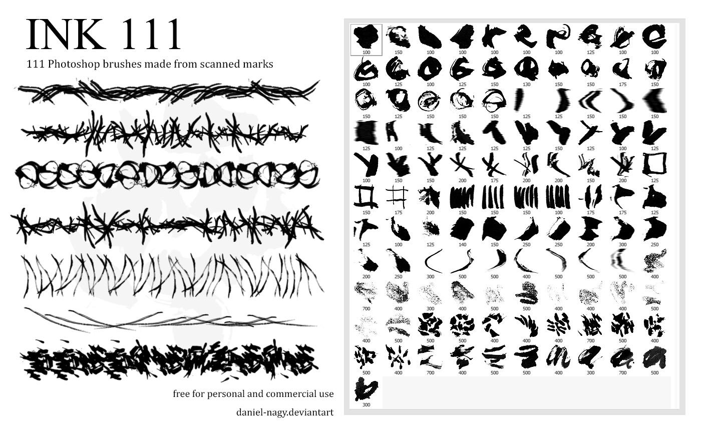
111 Ink Photoshop Brushes
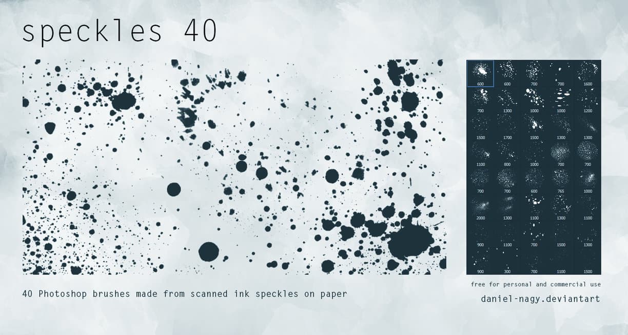
40 Speckles Free PS Brushes
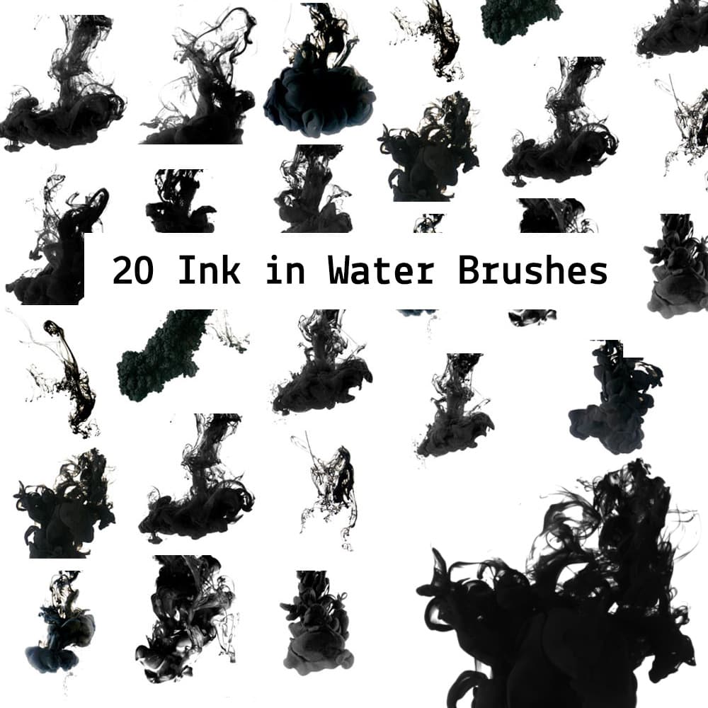
20 Ink in the Water
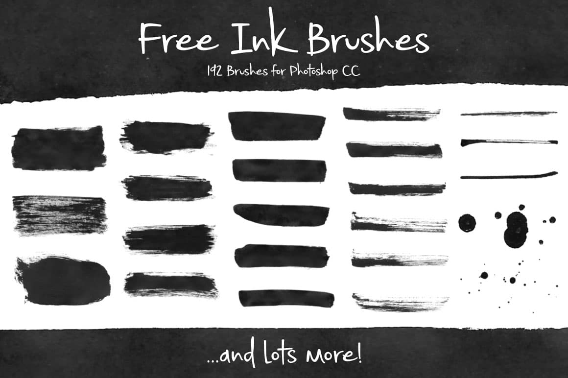
192 Free Ink Brushes for Photoshop
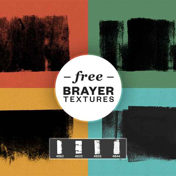
Free Brayer Textures Brushes
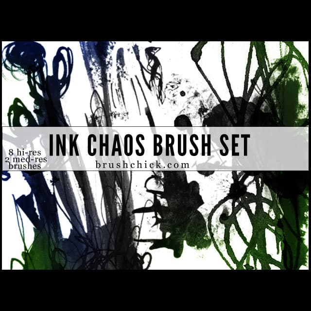
Ink & Chaos Brush Pack
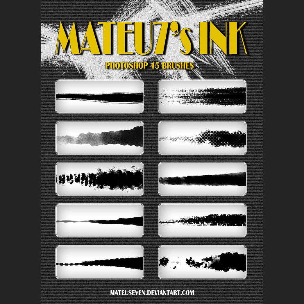
Ink Stroke Brushes
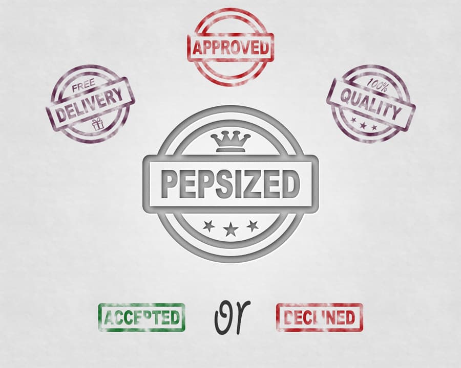
Ink Stamps
Where these strokes earn their keep
Apparel is the most literal use. A screen-printed shirt is ink on cloth, so the brush is doing the job it was born for, but the file has to respect the process. One colour per screen, no soft gradient at the edge, and the artwork on its own transparent layer so a printer can pull a separation without rebuilding it. Brushes stamp in whatever the foreground swatch holds, so set the colour first and stamp once. Recolouring afterwards leaves a halo you will spend longer removing than restamping.
Music and event posters are the second home. Here the ink is doing structural work rather than decoration: a heavy mark anchors a corner, a spray of speckles keeps a flat background from reading as empty, and a torn stroke behind a headline gives the type something to sit against. Build these at final size. A 2500 pixel brush covers a little over eight inches at 300 dpi, which is fine for A3 but starts falling apart if you stretch it to a billboard.
Comic and manga work is a different job again. Inking is about spotting blacks and controlling where a line tapers, so the useful brushes are the ones with an honest dry end rather than a uniform slab. Ink bleed matters here too. That slight spread where a wet line soaks into fibre is most of what separates a drawn panel from a traced one, and it is the detail people notice without being able to name it.
Packaging and book covers bring the last constraint, which is colour mode. A splatter that looks solidly black on screen can print muddy if it goes to press as 100% K on its own. Mixing a rich black keeps the density, and it is worth checking before the file leaves your machine rather than after the proof arrives.
If none of the marks here match the one in your head, scanning a wash of your own and turning it into a brush takes about ten minutes: our guide on how to create Photoshop brushes walks through the threshold settings that decide whether a scan reads as ink or as dirt.
What's in the collection
Twenty-two of the twenty-five files are brush sets, and the range inside them is wider than the word "ink" suggests. The largest is 192 Free Ink Brushes for Photoshop, downloaded more than 319,000 times, covering dry-brush drags, fully loaded strokes and the small blots that end a line. Solid Ink Splatter (around 180,000 downloads) and 44 Ink Photoshop Brushes (166,000) handle the thrown end of the spectrum, and the second of those ships JPG and PDF reference sheets alongside the ABR file, so you can see what you are about to stamp.
Splatter is the deepest sub-theme by some distance. Spray Paint Splatter Brushes sits at 91,000 downloads, with 8 Spray Brushes, 15 Splash Brushes, Splatters v1.0 and Ink & Chaos filling in the range between a fine mist and a thrown handful. 40 Speckles, at 77,000, is the one to reach for when a background needs noise rather than incident. 20 Ink in the Water takes a different route: photographed plumes of ink diffusing through water, which gives you soft volumetric shapes no dry brush can imitate.
Line work is covered separately. Crosshatch Photoshop Brushes does hatching and shading, while Ink Stroke Brushes and 11 Stroke Brushes handle clean directional marks. That last one throws in layer styles as well, which is a small thing until the day you need them.
Three files sit outside the brush category. 15 Free Ink and Paper Textures supplies the surface underneath, Ink Stamps arrives as a layered PSD you can edit rather than stamp, and Watercolor & Ink brushes Vol.3 covers the point where the two media meet. If that hybrid is the direction you want, the watercolour brush collection goes considerably further down that road.
Choosing a style
Three directions run through this collection, and picking one early saves a lot of undo. Controlled line work, meaning crosshatch, tapered strokes and clean stamps, suits editorial layouts, book interiors and anything that has to stay legible when it shrinks. Thrown marks, the splatters and sprays, belong on music artwork, streetwear and posters where the mess is the message: they photograph badly at small sizes, so give them room. Wet media, meaning the water plumes, brayer textures and watercolour hybrids, works where you want atmosphere rather than a shape, which is why it shows up on covers and title sequences more than on merchandise.
Mixing directions is where most compositions come apart. A crisp hatched illustration with one violent splatter across it reads as an accident rather than a decision, unless the splatter is deliberate enough to look chosen.
Two settings do most of the work once you have picked a direction. Flow, kept low, lets a stroke build in passes the way real ink darkens where the brush lingers, which is worth more than any amount of opacity tweaking after the fact. Size is the other one: stamping a 2500 pixel brush at 20% of its size sharpens every ragged edge it has, so the mark stops reading as ink and starts reading as a shape. Scale the canvas down, not the brush. The paper textures are what tie the three directions together, since a single grain layer set to multiply across the whole file makes strokes from three different sets look like they came out of the same bottle.
New to loading external brushes? The installation guide covers it in under a minute. And if you have ink brushes of your own gathering dust, submit them here and they will end up on this page.
Frequently Asked Questions
Are these ink brushes for Photoshop free to download?
Yes, every set on this page is free to download. Licensing varies by author though, so open the license note on an individual set before you use it commercially. Some allow commercial work outright, others ask for attribution or restrict resale, and that information sits on each item page rather than being the same across the collection.
How do I install an ABR file in Photoshop?
Double-click the ABR file and Photoshop loads it into the Brushes panel, which is the quickest route on both Windows and macOS. If that fails, open the Brushes panel, choose Import Brushes from its menu, and point it at the file. The new set appears at the bottom of the list, grouped under its own folder name.
Why does my brush stamp in the wrong colour?
Photoshop brushes are greyscale masks, not coloured artwork, so they stamp in whatever the foreground swatch currently holds. Set the colour before you stamp. Recolouring afterwards with a hue adjustment tends to leave a fringe along the soft edges, and locking layer transparency to repaint is slower than simply stamping again.
What is ink bleed and can I fake it with a brush?
Ink bleed is the slight spread where a wet line soaks into paper fibre, and it is what makes a drawn line look drawn. Several sets here have it baked into the brush tip. You can also approximate it by stamping at low flow on a layer beneath your line work, then nudging it a pixel or two off register.
Which brushes work best for comic inking?
Look for sets with tapered ends and an honest dry finish rather than uniform slabs, since inking is mostly about controlling where a line thins out. Crosshatch sets cover shading, and stroke sets handle the directional line work. Splatter brushes are the wrong tool here and tend to fight the panel rather than support it.
Can I use these for screen-printed T-shirts?
Yes, and ink brushes suit that process well because a screen print is literally ink on fabric. Keep the artwork to one colour per screen, avoid soft gradients at the edges, and hand the printer a transparent layer rather than a flattened file. Check the individual license first if the shirts are going on sale.
What resolution do these brushes support for print?
Most sets here top out around 2500 pixels, which covers a little over eight inches at 300 dpi. That is comfortable for A3 and smaller. For anything larger, build the element at final size instead of scaling the stamp up, or use the paper textures as a base layer where the resolution ceiling matters less.
Do I need the latest Photoshop version to open these?
No. The ABR format has been stable for years, and these sets load in current Photoshop as well as in older releases. Brushes saved with newer tool settings may lose some dynamics in much older versions, but the tip shape itself still imports and stamps correctly.
Can I load these ink brushes in GIMP, Procreate, or Krita?
All three take an .ABR file, each in its own way: GIMP opens it directly, Procreate imports it through the brush panel, and Krita reads the tip shapes as brush-tip textures. Affinity Photo imports the format too. Ink sets lean on dynamics like scatter and flow, and those settings are the part most likely to differ after import, so expect the tip shapes to arrive intact and plan to rebuild the stroke feel in the target app. Full Photoshop remains the reference for matching the previews.